Angular Charts Series Articles
- Best Angular Chart Libraries
- How to use ngx-charts in angular application
- Data Vizualization with ECharts in Angular Using NGX-ECHARTS
- Awesome Charts in Angular 13 with ng2-charts
Data visualization is the graphical representation of data. This helps businesses to easily understand large amount of data and make critical decisions.
In angular, we have various charting libraries implement data visualization with various charts.
Check out the list of best angular chart libraries.
In the previous article, we have seen how to create charts using ngx-charts library.
In this article, we will see data visualization with ECharts in angular with ngx-echarts.
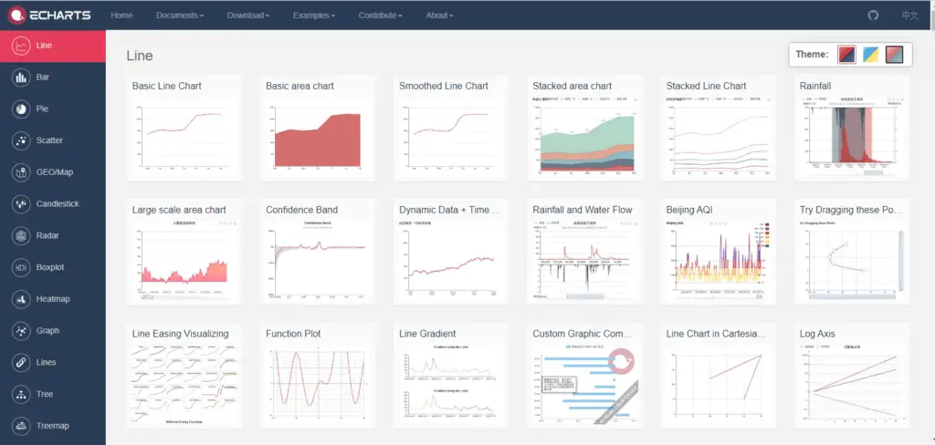
ECharts is an open-sourced, powerful, interactive charting and visualization JavaScript library, which can run fluently on PC and mobile devices.
It is compatible with most modern Web Browsers, e.g., IE8/9/10/11, Chrome, Firefox, Safari, and so on.
ECharts depends on ZRender, a graphic rendering engine, to create intuitive, interactive, and highly-customizable charts.
ECharts gives large set of chart types, and can handle vary large data sets to generate charts.
It has over 42K github start.
ECharts includes the following chart types :
Line series, bar series, scatter series, pie charts, candle-stick series, boxplot series for statistics, map series, heatmap series, line series for directional information, graph series for relationships, treemap series, sunburst series, parallel series for multi-dimensional data, funnel series, gauge series
Besides the built-in chart types, ECharts also provide the custom series for users to create a specific chart type.
ECharts provide features to create realtime and interactive charts. It also includes the 3D charts.
ngx-echarts is an Angular(ver >= 2.x) directive for ECharts (ver >= 3.x).
ECharts is a javascript library, ngx-echarts is a kind of wrapper around the ECharts, which allows us to manage echarts configuration.
ngx-echarts initialize the echarts object and set the options. We just need to pass the options as an input property.
It supports dynamically configuring themes and creating realtime charts.
So now let’s see, using echarts in angular application with ngx-echarts.
- Create a new angular application using the following command(Note: skip this step if you want to add ngx-echarts in the existing angular application, At the time of writing this article I was using angular 10).
ng new ngx-echarts-demo
- Install
echartsandngx-echartspackage in an angular application using the following command.npm install echarts -S npm install ngx-echarts -S
- Import
NgxEChartsModulefromngx-echartsandechartsinAppModule.ngx-echartsinternally uses theechartslibrary to render chart.
We need to pass the reference ofechartsinforRootoption parameter ofNgxEChartsModule
So our final AppModule will look like :
import { BrowserModule } from '@angular/platform-browser';
import { NgModule } from '@angular/core';

import { AppComponent } from './app.component';

import * as echarts from 'echarts';
import { NgxEchartsModule } from 'ngx-echarts';

import { HttpClientModule } from '@angular/common/http';
import { FormsModule } from '@angular/forms';
@NgModule({
  declarations: [
    AppComponent
  ],
  imports: [
    BrowserModule,
    NgxEchartsModule.forRoot({
      echarts
    }),
    HttpClientModule,
    FormsModule
  ],
  providers: [],
  bootstrap: [AppComponent]
})
export class AppModule { }
Great✨✨✨ Installation steps are done. Now let’s develop various charts using ngx-echarts components.
We will create a COVID-19 TRACKER Application, where user can see the number of confirmed cases, recovered cases and deaths.
We will use Coronovirus COVID19 API https://api.covid19api.com to get the real-time country-wise COVID19 data.
I have created one application service for HTTP Calling as shown below.
import { Injectable } from '@angular/core';
import { HttpClient } from '@angular/common/http';
import { Country, CountryStatus } from './models';

const BASE_URL = `https://api.covid19api.com/`;
const COVID_URL = {
  COUNTRIES: `${BASE_URL}countries`,
  BY_COUNTRY: (country: string) => `${BASE_URL}dayone/country/${country}`,
}

@Injectable({
  providedIn: 'root'
})
export class AppService {

  constructor(private http: HttpClient) { }

  getCountries$ = this.http.get<Country[]>(COVID_URL.COUNTRIES);
  getCasesByCountry = (countrySlug: string) => {
    return this.http.get<CountryStatus[]>(`${COVID_URL.BY_COUNTRY(countrySlug)}`)
  }
}
Initially, we will fetch the country list, and on change of country, we will get the covid cases status for that country.
To render echart from this records we need to add one div with echart directive on template as below :
<div echarts [options]="chartOptions" class="demo-chart"></div>
As you can see we need to pass the options object. It is an echarts configuration object. We need to provide all the chart related configuration in this object.
It has a standard format specified in echarts configuration options documentation.
import { Component, OnInit } from '@angular/core';
import { AppService } from './app.service';
import { CountryStatus, Country } from './models';
import { tap } from 'rxjs/operators';
@Component({
  selector: 'app-root',
  templateUrl: './app.component.html',
  styleUrls: ['./app.component.css']
})
export class AppComponent {
  selectedCountry: string;
  countryCasesChartOptions: any;
  cases: CountryStatus[] = [];

  countries$ = this.appService.getCountries$.pipe(tap(countries => {
    this.selectedCountry = countries[0].Slug;
    this.setOptions();
  }));


  constructor(private appService: AppService) {

  }


  onChangeCountry() {
    this.appService.getCasesByCountry(this.selectedCountry).subscribe(cases => {
      this.cases = cases;
      this.setOptions();
    });
  }

  setOptions() {
    this.countryCasesChartOptions = {

      title: {
        text: 'COVID-19 STATUS CHART',
      },
      legend: {
        data: ['Confirmed', 'Recovered', 'Deaths']
      },
      tooltip: {

      },
      xAxis: {
        data: this.cases.map(c => new Date(c.Date).toLocaleDateString()),
      },
      yAxis: {
        type: 'value'
      },
      series: [{
        name: 'Confirmed',
        type: 'line',
        data: this.cases.map(c => c.Confirmed),
      },
      {
        name: 'Recovered',
        type: 'line',
        data: this.cases.map(c => c.Recovered),
      },
      {
        name: 'Deaths',
        type: 'line',
        data: this.cases.map(c => c.Deaths),
      },

      ]
    };

  }

}
<nav class="navbar navbar-expand-sm navbar-dark bg-primary">
  <a class="navbar-brand" href="#">COVID TRACKER</a>
</nav>

<div class="container-fluid">
  <div class="row">
    <div class="col-md-12">
      <div class="form-group">
        <label for="">Country</label>
        <select class="form-control" name="" id="" [(ngModel)]="selectedCountry" (change)="onChangeCountry()">
          <option *ngFor="let c of countries$ | async" [value]="c.Slug">{{c.Country}}</option>
        </select>
      </div>
    </div>
    <div class="col-md-12">
      <div echarts [options]="countryCasesChartOptions" class="demo-chart"></div>
    </div>
  </div>
</div>
In the above code, we will provide all the echarts configuration in countryCasesChartOptions.
ECharts Configuration Properties:
title: specifies the title of chart. we can also configure the subtitle, horizontal and vertical alignment and colors with this property.
In this article, We have seen data visualization with echarts in angular with ngx-echarts. We have created the COVID TRACKER application for demonstrating the echarts data visualization.
I hope you like this article, please provide your valuable feedback and suggestions in below comment section🙂.
For more updates, Follow us 👍 on NgDevelop Facebook page.