
Form Validators
Validators are rules which an input control has to follow. If the input doesn’t match the rule then the control is said to be invalid.
In our form, Some fields are required, for the title we will use minimum length 10, and for the color we will use the pattern for the alphabets only. For price we will use the minimum value validation.
We can apply the validators by adding attributes to the template, or by adding validators in form model.
Now we are working with the model-driven forms, so we will see the Validators in the model-driven form.
In the next chapter, we will see the Validation by adding attributes to the template.
Angular comes with the small set of prebuilt validators to match the once we can define via standard HTML 5 attributes, namely required, minlength, maxlength and pattern which we can access from the Validators class in @angular/forms library.
To use this Validators, we need to import the Validators class from @angular/forms library in add-product-model.component.ts, as shown below
import { Validators } from '@angular/forms'; We need to insert the validators while we are initializing the Form Control Object.
Syntax to add Validators in FormControl is shown below.
FormControl(<initial value>,<list of Validators>)
For Example,
this.title = new FormControl(‘’,Validators.required);
This will initialize title form control with the initial value as an empty string, and make it as required field.
We can add the multiple validations like required and minlength by using Validators in an array.
As shown below,
this.title = new FormControl('', [Validators.required, Validators.minLength(10)]); Same way, we will add validators for the other form controls. as shown below
this.title = new FormControl('', [Validators.required, Validators.minLength(10)]);
this.modelName = new FormControl();
this.color = new FormControl('', Validators.pattern('[a-zA-Z]*'));
this.productType = new FormControl('', Validators.required);
this.brand = new FormControl('', Validators.required);
this.price = new FormControl('', [Validators.required, Validators.min(1)]);
We have inserted the validations in the form control. Now we need to show error with visual feedback if the control is invalid.
Form Control has different states based on which we can show the error message and hide it when the control is valid.
The form control instance on our model encapsulates the state of the control itself, such as if it is currently valid or invalid.
We will understand the form control states using following example.
add following code for title form control on add-product-model.component.html
<div class="form-group">
            <label>Title</label>
            <input type="text" class="form-control" formControlName="title">
            <div class="alert alert-info" role="alert">
              <strong>Valid ? </strong>{{title.valid}} <br>
              <strong>Invalid ? </strong>{{title.invalid}}<br>
              <strong>Touched ? </strong>{{title.touched}}<br>
              <strong>Untouched ? </strong>{{title.untouched}}<br>
              <strong>Dirty ? </strong>{{title.dirty}}<br>
              <strong>Pristine ? </strong>{{title.pristine}}<br>
            </div>
</div>
This code will give output as below,
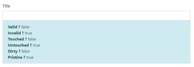
Now lets understand each form control state.
Dirty property is true if a user changes the value of form control.
Pristine is the opposite of dirty.
Pristine property is true if a user doesn’t change the value of form control, otherwise, it is false.
As you can see in the above example initially pristine was true, and dirty was false, but when you change the input value dirty becomes true, and pristine becomes false.
A form control is said to be touched if a user focused on the control and then focused on something else.
For example by clicking into the control and then pressing tab or clicking on another control in the form.
The difference between touched and dirty is that with touched the user doesn’t need to actually change the value of the input control.
As shown in the above example touched is false initially, and untouched is true, once we focus on input box and click outside the control, touched becomes true and untouched becomes false.
Valid is true if the field doesn’t have validators or all its validators are passing.
Again the opposite of valid is invalid.
title property has two validators, required and minlength, so as shown above initially valid is false, and invalid is true, once all validators are passed, valid becomes true and invalid becomes false.
Bootstrap provides a different way to show an error message to the user.
- By using Alert component of bootstrap
- By using visual feedback for the form controls when they are invalid.
Lets first see the validation style using Alert Component.
<div class="form-group">
            <label>Title</label>
            <input type="text" class="form-control" formControlName="title">
            <div class="alert alert-danger" role="alert" *ngIf="title.errors && (title.touched || title.dirty)">
              Invalid Title
            </div>
</div>
This will show the alert message for invalid title input as below.
In this type of style, we will use the alert component of bootstrap as shown above. We need use below condition to display alert box
*ngIf="title.errors && (title.touched || title.dirty)"
Because we do not want to display alert message initially. We will show the alert message only if there is any error, as well as, a user has touched the control or user has changed the input.
In this type or Validation style we are not controlling the border color of the control, that we can do by using the visual feedback validation style.
<div class="form-group">
            <label>Title</label>
            <input type="text" class="form-control" formControlName="title" [ngClass]="{'is-invalid': title.errors && (title.touched || title.dirty), 'is-valid':title.valid}"   >
            <div class="invalid-feedback" >
              <strong>Invalid Title</strong>
            </div>
</div>
This will show the visual feedback for invalid title input as below.
Bootstrap provides two classes namely, is-invalid and is-valid, using this two classes of bootstrap form validation you can change the border color of control as well as control the invalid-feedback division.
- Note
We are using [ngClass] directive, which is an attribute directive, this directive apply the style class to the control based on valid condition. For example,
[ngClass]="{'is-invalid': title.errors && (title.touched || title.dirty), 'is-valid':title.valid}" This will apply is-invalid class when title.errors && (title.touched || title.dirty) is true, the same way it will apply is-valid if title.valid is true.
As shown in the above example,
is-invalidclass makes control border color red, as well as it will show the invalid-feedback division.is-validclass makes control border color green.
You can use either of the validation style, based on your requirement and UI strategy.
In above example, we have displayed only one message for both required and minlength validators.
we can also show different message based on Validators type.
We can do that by checking another property on our form control called errors.
errors is an object which has one entry per validator, the key is the name of the validator and if the value is not null then the validator is failing.
<div class="form-group">
            <label>Title</label>
            <input type="text" class="form-control" formControlName="title" [ngClass]="{'is-invalid': title.errors && (title.touched || title.dirty), 'is-valid':title.valid}"   >
            <div class="invalid-feedback" >
              <strong *ngIf="title.errors?.required">Title is required</strong>
              <strong *ngIf="title.errors?.minlength">Title length must be greated than 10 character. </strong>
            </div>
</div>
If an errors object has a key of required it means the control is failing because it’s required and the user hasn’t entered any value into the input field.
If we will see in errors property in deep, it also provides a useful information. we can see the other information of an errors object by using it in interpolation with JSON pipe. as shown below,
{{title.errors | json}} For example, if title control is failing for minlength validator, title.errors give us minlength object with extra information as requiredLength and actualLength properties. as shown below
{
  "minlength": {
    "requiredLength": 8,
    "actualLength": 1
  }
}
We can use this information in our validation error message to give the user a bit more help in resolving the issue. As shown below
<div class="form-group">
            <label>Title</label>
            <input type="text" class="form-control" formControlName="title" [ngClass]="{'is-invalid': title.errors && (title.touched || title.dirty), 'is-valid':title.valid}"   >
            <div class="invalid-feedback" >
              <strong *ngIf="title.errors?.required">Title is required</strong>
              <strong *ngIf="title.errors?.minlength">Title length must be greated than {{title.errors?.minlength.requiredLength}} character.
                        {{title.errors?.minlength.requiredLength - title.errors?.minlength.actualLength}} more character required. </strong>
            </div>
</div>
The same way we will add the validation message for other form controls.
- Tip
The ? is called the elvis operator, it means: “Only try to call the property on the right of ? if the property on the left of ? is not null”
import { Component, OnInit } from '@angular/core';
import { FormGroup, FormControl} from '@angular/forms';
import { Validators } from '@angular/forms';
import { Product } from '../models/product';
@Component({
  selector: 'app-add-product-model',
  templateUrl: './add-product-model.component.html',
  styleUrls: ['./add-product-model.component.css']
})
export class AddProductModelComponent implements OnInit {

  productTypes = ['Laptop', 'Mobile'];

  myForm: FormGroup;

  title: FormControl;
  modelName: FormControl;
  color: FormControl;
  productType: FormControl;
  brand: FormControl;
  price: FormControl;


  constructor() { }

  ngOnInit() {

    this.title = new FormControl('', [Validators.required, Validators.minLength(10)]);
    this.modelName = new FormControl();
    this.color = new FormControl('', Validators.pattern('[a-zA-Z]*'));
    this.productType = new FormControl('', Validators.required);
    this.brand = new FormControl('', Validators.required);
    this.price = new FormControl('', [Validators.required, Validators.min(1)]);

    this.myForm = new FormGroup({
      'title': this.title,
      'modelName': this.modelName,
      'productType': this.productType,
      'color': this.color,
      'brand': this.brand,
      'price': this.price
    });

  }

}
<div class="card">
  <div class="card-body">
    <h4 class="card-title">ADD PRODUCT (Model Driven Form)</h4>
    <div class="row">
      <div class="col-md-6">
        <form [formGroup]="myForm" novalidate>
          <div class="form-group">
            <label>Title</label>
            <input type="text" class="form-control" formControlName="title" [ngClass]="{'is-invalid': title.errors && (title.touched || title.dirty), 'is-valid':title.valid}"   >
            <div class="invalid-feedback" >
              <strong *ngIf="title.errors?.required">Title is required</strong>
              <strong *ngIf="title.errors?.minlength">Title length must be greated than {{title.errors?.minlength.requiredLength}} character. {{title.errors?.minlength.requiredLength - title.errors?.minlength.actualLength}} more character required. </strong>
            </div>
          </div>
          <div class="form-group ">
            <label>Model Name</label>
            <input type="text" class="form-control" formControlName="modelName">
          </div>
          <div class="form-group ">
            <label>Color</label>
            <input type="text" class="form-control" formControlName="color" [ngClass]="{'is-invalid': color.errors && (color.touched || color.dirty)}">
            <div class="invalid-feedback" >
              <strong>Only Alphabets are allowed. </strong>
            </div>
          </div>
          <div class="form-group ">
            <label>Product Type</label>
            <select class="form-control" formControlName="productType" [ngClass]="{'is-invalid': productType.errors && (productType.touched || productType.dirty), 'is-valid':productType.valid}" >
              <option *ngFor="let p of productTypes" [value]="p">{{p}}</option>
            </select>
            <div class="invalid-feedback" >
                <strong>Select Product Type.</strong>
            </div>
          </div>
          <div class="form-group">
            <label>Brand</label>
            <input type="text" class="form-control" formControlName="brand" [ngClass]="{'is-invalid': brand.errors && (brand.touched || brand.dirty), 'is-valid':brand.valid}">
            <div class="invalid-feedback" >
                <strong>Brand Name is required.</strong>
            </div>
          </div>
          <div class="form-group">
            <label>Price</label>
            <input type="number" class="form-control" formControlName="price" [ngClass]="{'is-invalid': price.errors && (price.touched || price.dirty), 'is-valid':price.valid}">
            <div class="invalid-feedback" >
                <strong *ngIf="price.errors?.required"> Price is required</strong>
                <strong *ngIf="price.errors?.min"> Price should be greated than zero.</strong>
            </div>
          </div>
          <button type="submit" class="btn btn-primary">Submit</button>
          <button class="btn btn-default" >Reset</button>
        </form>
      </div>

      <div class="col-md-6">
        <label>
          <strong>myForm : JSON</strong>
        </label>
        <pre class="alert alert-dark">{{myForm.value | json}}</pre>
      </div>
    </div>
  </div>
</div>
In this chapter, we have seen,
- Overview of form validation.
- Use of Validators for Form Validation
- Form Control State: Dirty & Pristine, Touched & Untouched, Valid & Invalid
- Validation Styling using Alert Component of Bootstrap and Visual Feedback
- Validator Specific Error Message