User Interface makes the first impression about your application on users mind. A good User Interface encourages the user to use the application more and more.
Users interact with an application using different platforms like PCs, Mobile Devices, and Tablets. So User Interface is the critical part of both web and mobile application.
You can develop responsive User Interface by own, but it takes time to develop all the responsive UI components. Instead of developing the UI Components manually you can use external UI component libraries, which are efficient, responsive and easy to use.
With the increasing in popularity and a better community support, Angular also have some excellent UI component libraries which you can use to make better User Interface of Angular Application.
You can save a lot of time if you use good Angular UI Component Libraries that fit with your workflow.
Here is, the list of Best Angular UI Component Libraries you should consider for your next Angular App Development.
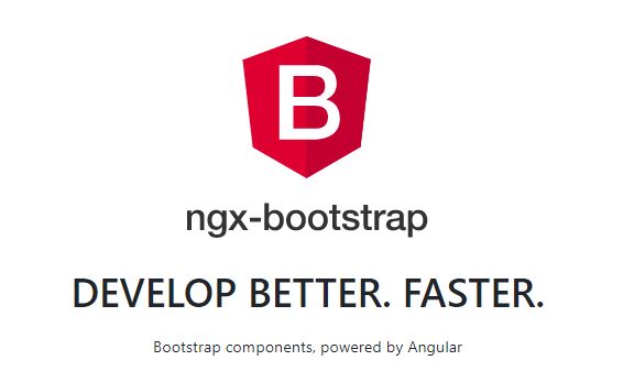
ngx-bootstrap is one of the most popular Angular UI components library. It is a part of valor-software.
It contains all core (and not only) Bootstrap components powered by Angular. So you don’t need to include original JS components, but we are using markup and CSS provided by Bootstrap.
All the bootstrap components are built with Angular so it provides responsive UI and better performance on all platforms.
It is the best way to quickly integrate Bootstrap 3 or Bootstrap 4 Components with Angular
Angular UI Components of ngx-bootstrap : Accordion, Alerts, Buttons, Carousel, Collapse, Datepicker, Dropdowns, Modals, Pagination, Popover, Progressbar, Rating, Sortable, Tabs, Timepicker, Tooltip and Typeahead.
Not every component from valor-software is part of this framework, there are few more components available on github like ng2-charts, ng2-table, ng2-select, ng2-file-upload, and ng2-tree.
Ng2-table is a smart table with pagination, filter, and sorting. Refer Best Angular Tables for more information.
- STARS : 3.9 K
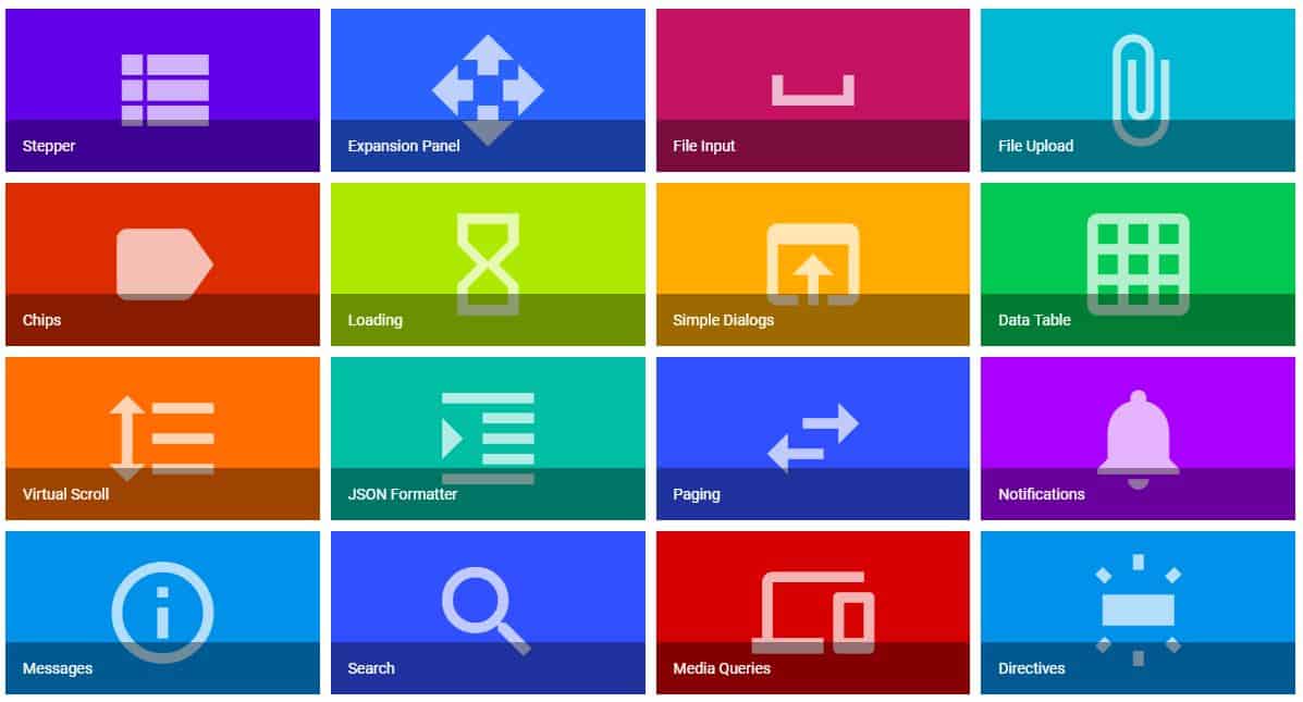
Teradata Covalent is a UI Platform that combines proven design language with a comprehensive web framework, built on Angular & Angular-Material (Design).
Covalent gives you a quickstart to build a modern web application UI and ensure consistency across your enterprise products.
Some of Covalent’s most important features include:
- Angular-Material
- Angular Command-line interface (CLI) for builds, deploys, testing & more.
- Drastically simplified interface layouts (for dashboards, lists, etc).
- Custom web components (stepper, file upload, expansion panels & more).
- 750+ Material Design icons.
- Style Guide with brand standards, color palettes & tips.
- Design Patterns for consistent, reusable web components such as cards, forms, etc.
- Testing Tools for both unit tests and end-to-end tests.
- Quickstart app to get started right away.
- STARS : 1.6 K
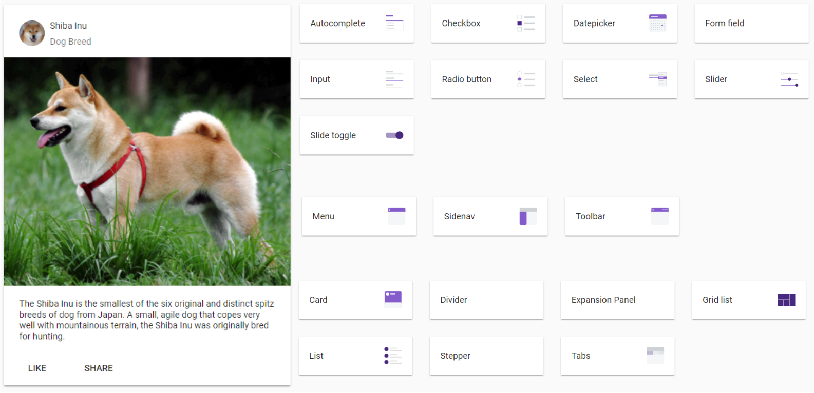
Angular Material is the Angular’s Official Component Library.
It is based on Google’s Material Design. As per Google, “Material Design is a specification for a unified system of visual, motion, and interaction design that adapts across different devices. Our goal is to deliver a lean, lightweight set of Angular-native UI elements that implement the material design system for use in Angular SPAs.”
Angular Material is both a UI Component framework and a reference implementation of Google’s Material Design Specification. This project provides a set of reusable, well-tested, and accessible UI components based on Material Design.
The aim of Material Design is to unify the user experience on the web, mobile and tablet devices with modern UI component.
UI Components of Angular Material :
- Form Controls like AutoComplete, Checkbox, Datepicker, Form field, Input, Radio button, Select, Slider and Slide Toggle.
- Navigation Menu, Side Navigation, and ToolBar
- Layout Components are Card, Divider, Expansion Panel, Grid List, List, Stepper, Tabs
- Buttons, Chips, Icon, Progress Bar, Progress Spinner.
- Different types of Popups like Dialog, Snackbar, Tooltip
- Data table
- Refer Angular Material Data table in Best Angular Tables.
- STARS : 13.8 K
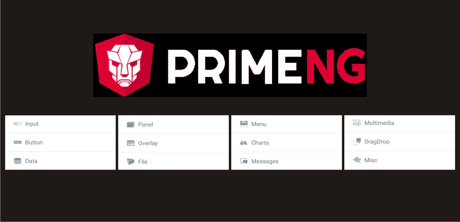
Prime NG is the complete User Interface Suite for Angular.
It is a collection of rich UI components for Angular. Prime NG have 70+ easy to use UI components.
All widgets are open source and free to use under MIT License.
PrimeNG enhances mobile user experience with touch-optimized responsive design elements.
Angular UI Components of PrimeNG :
- Basic Input Components plus advanced input components like AutoComplete, Calendar, ColorPicker, Editor, KeyFilter.
- Buttons and SplitButton.
- Data Components like DataGrid, DataList, DataTable, Tree Table and more.
- Panels Components like Accordion, Card, TabView, Toolbar, ScrollPanel.
- Overlay Components like Dialog, Lightbox, Overlay Panel.
- File Upload Component.
- Menu Components like MenuBar, MegaMenu, Breadcrumb, TabMenu.
- Charts Like Bar, Radar, Pie, Line, Doughnut.
- Alert Messages using Messages and Growl.
- Advanced Components like Galleria, Drag and Drop, Progress Bar, Captcha.
- STARS : 3.9 K

ng-bootstrap provides Angular – specific widgets built from the ground and using Bootstrap 4 CSS.
No dependencies on 3rd party JavaScript.
Angular UI Components of ng-bootstrap : Accordion, Alert, Buttons, Carousel, Collapse, DatePicker, Dropdown, Modal, Pagination, Popover, Progressbar, Rating, Tabs, Timepicker, ToolTip, Typeahead.
Mostly ng-bootstrap is same as the ngx-bootstrap, but both developed by the different project teams.
I personally recommend to use ngx-bootstrap instead of ng-bootstrap, because ngx-bootstrap is more mature and stable for production, while ng-bootstrap is under development.
- STARS : 5.1 K
Create beautiful high-quality hybrid mobile apps for Android and iOS with Angular and Onsen UI.
Onsen UI provides Beautiful Angular Directives, automatically styled per platform
Onsen UI for Angular exposes a simple but powerful API. All UI components can be easily plugged into your Angular mobile app.
- STARS : 6.1 K
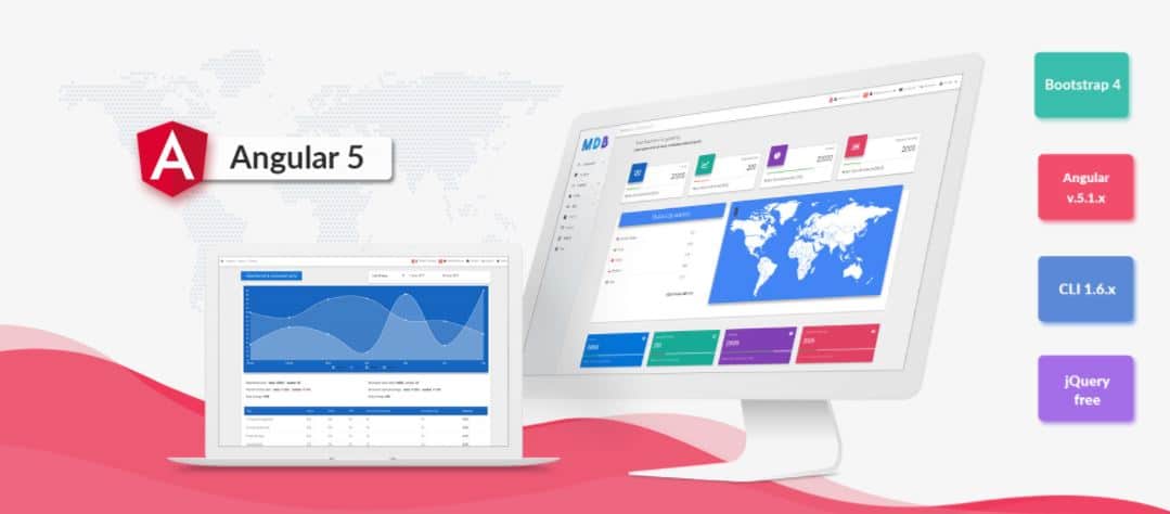
MDB Built with Angular 5, Bootstrap 4 and TypeScript. CLI version available. Absolutely no jQuery.
It comes with 400+ material UI elements, 600+ material icons, 74 CSS animations, TypeScript modules, SASS files and many more.
It is free for personal and commercial use.
Angular UI Components of MDB : Cards, Buttons, Dropdowns, Inputs, Forms, Footer, Navbars, List group, Panels, Pagination, Progress bar, Tabs & Pills, Tags, Labels, and Badges.
- STARS : 306
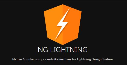
NG-LIGHTNING provides Native Angular components & directives for Lightning Design System
It is Built upon the frameworks like Angular and Salesforce’s Lightning Design System.
NG-LIGHTNING is still in the development phase, but it provides good native angular components.
Angular UI Components of NG-LIGHTNING : Badges, Breadcrumbs, Buttons, DataTables, DatePickers, Forms, Icons, Images, Lookups, Menu, Modals, Notification, Pagination, Pills, Popover, Ratings, Sections, Spinners, and Tabs.
- STARS : 627

Semantic UI is one of the most popular UI Component libraries for JavaScript frameworks.
ngSemantic is built on the top of Angular 2 and Semantic UI.
ngSemantic UI components are : Button, Flag, Loader, List, Segment, Menu, Form, Input, Select, Message, Accordion, Dimmer, Modal, Rating, and Sidebar.
Note: ngSemantic project is not updated since one year.
- STARS : 917

Clarity Design System: It is an open source design system that brings UX guidelines, HTML/CSS framework, and Angular components working together to craft exceptional experiences
Angular UI Components of Clarity : Alerts, Datepicker, Code Highlight, DataGrids, Dropdown, Modals, Side Navigation, Stack View, Tabs, ToolTips, Tree View, Vertical Nav, and Wizards.
- STARS : 3.2 K
Ignite UI provides 30+ Material based easy to use Angular UI Components.
It is designed and optimized for high performance, high volume data scenarios.
Angular UI Components of Ignite UI : Data Grid, ListView, Carousel, Calendar, Dialog Window, Slider, Scrollbar, Ripple, Basic Input Components, Tabs, Card, Avatar, Snackbar, Toast, Navbar, and Datepicker.
Above all are the free Angular UI component libraries, which you can use in your angular application.
Kendo UI: One of the first major UI frameworks to support Angular.
Vaadin: Vaadin has a material design inspired UI components for building great web apps.
Amexio: Amexio is a rich set of (Google) Angular 5 UI components powered by Responsive Design along with Google Material Design Support and Amexio based Themes support.
DevExtreme: 50+ UI Components including data grid, pivot grid, scheduler, charts, editors, maps and other multi-purpose controls for creating Responsive Web Development.
Wijmo: Deliver next-generation HTML5 applications with Wijmo Core, a collection of true JavaScript controls written in TypeScript and built for speed
- Includes touch-first design
- First-class Angular support- Angular v5 supported
- No dependencies
- FlexGrid, best JavaScript grid available
jQwidgets : jQwidgets provides Angular UI components including Data Grid, Tabs, Charts, Scheduler, Navigation Bar, Basic Input controls, Color Picker, Ratings, Draw, Drag and Drop.